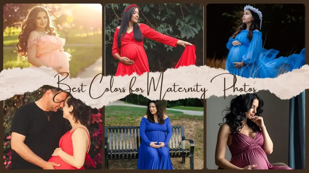
Every maternity portrait is a love story told through colour. The shades you choose—soft creams, dreamy pastels, or deep jewel tones—don’t just complement your gown; they define the emotion and mood of your entire session. The best colours for maternity photos highlight your glow, reflect your personality, and turn fleeting moments into timeless works of art.
At Maternity Shoots, we help every expecting mother find the perfect palette—colours that enhance your beauty, align with your setting, and express the deep connection of motherhood.
Table of Contents
ToggleHarnessing Colour as the Primary Storyteller
The Role of Colour in Maternity Photography
Colour is emotion captured in light. A carefully planned maternity photoshoot colour palette doesn’t just flatter it tells your story.
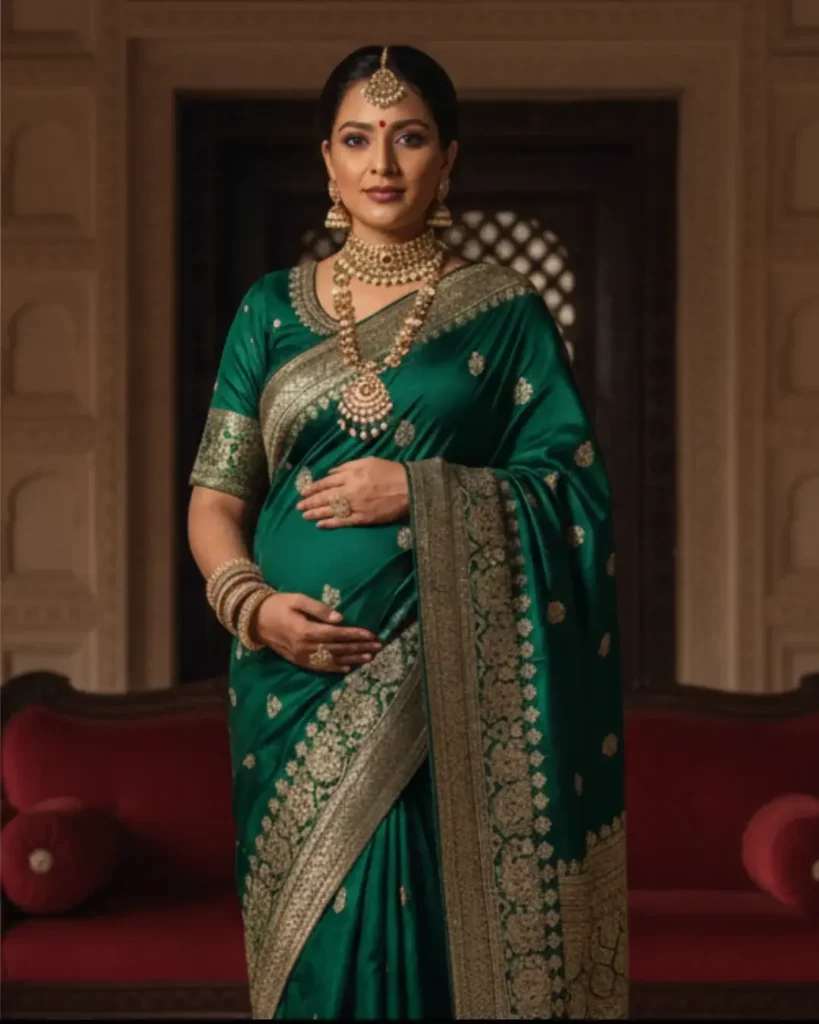
Soft tones like blush, cream, or lavender convey calmness and tenderness, ideal for peaceful, fine-art portraits. Bold hues like emerald, crimson, or sapphire radiate power, confidence, and elegance.
At Maternity Shoots, every shade is chosen intentionally to complement your environment, flatter your complexion, and bring emotional depth to each frame.
Colour Psychology: The Emotional Language of Hues

Each colour evokes emotion. Here’s how they shape your story:
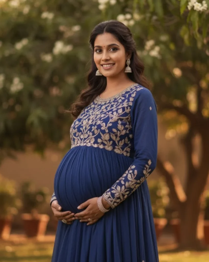
- Warm Colours (Red, Orange, Yellow): Express joy, love, and warmth — ideal for outdoor or golden-hour shoots.
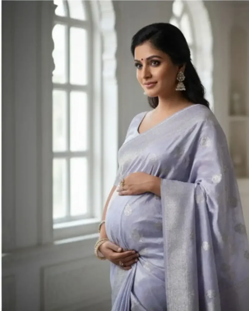
Cool Colours (Blue, Green, Lavender): Symbolize serenity and calm — perfect for studio sessions.
- Neutrals (White, Beige, Gray): Timeless and elegant — best for classic, minimalist portraits.
Our team curates tones that align with your emotion, location, and light.
Using Color as a Strategic Tool
A beautiful color story is timeless. At Maternity Shoots, we help mothers choose palettes that not only look radiant on camera but also fit beautifully in their homes.
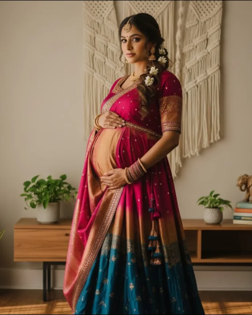
Dark tones like navy, burgundy, or wine add luxury and depth but require expert lighting to sculpt the bump and preserve texture.
Our photographers balance contrast and light to ensure elegance and longevity in every frame.
Advanced Color Theory and Contrast Management
Mastering the Color Wheel
The color wheel helps you pair tones purposefully.
- Complementary Colors (e.g., Red & Green): Create visual pop—ideal for outdoor shoots.
- Analogous Colors (e.g., Blue, Teal, Green): Build harmony and softness—great for cohesive, calm portraits.
At Maternity Shoots, every backdrop, gown, and prop is selected to achieve the perfect visual balance.
Warm vs Cool Hues

- Red: Passion and love, perfect for bold outdoor shoots.
- Orange/Yellow: Happiness and optimism, ideal for sunlit, lively sessions.
- Blue: Calm and serene, great for peaceful portraits.
- Green: Growth and renewal, blends beautifully with natural settings.
- Purple: Luxury and sophistication, suitable for dramatic and elegant shots.
A warm gown against a cool background—or vice versa—creates instant focus on the expecting mother.
Contrast & Depth

- Blending vs Contrast: Decide if the wardrobe should blend with or pop from the background.
- Light/Dark Interplay: Use shadows and highlights to sculpt the bump and add depth to the photo.
Contrast defines your shape and adds visual rhythm. Light gowns against dark backgrounds feel ethereal; deep jewel tones against soft backdrops feel bold and cinematic.
At Maternity Shoots, we use rim and backlighting to enhance form and glow—ensuring your bump becomes the visual heart of the portrait.
Neutral & Timeless Hues for Classic Portraits
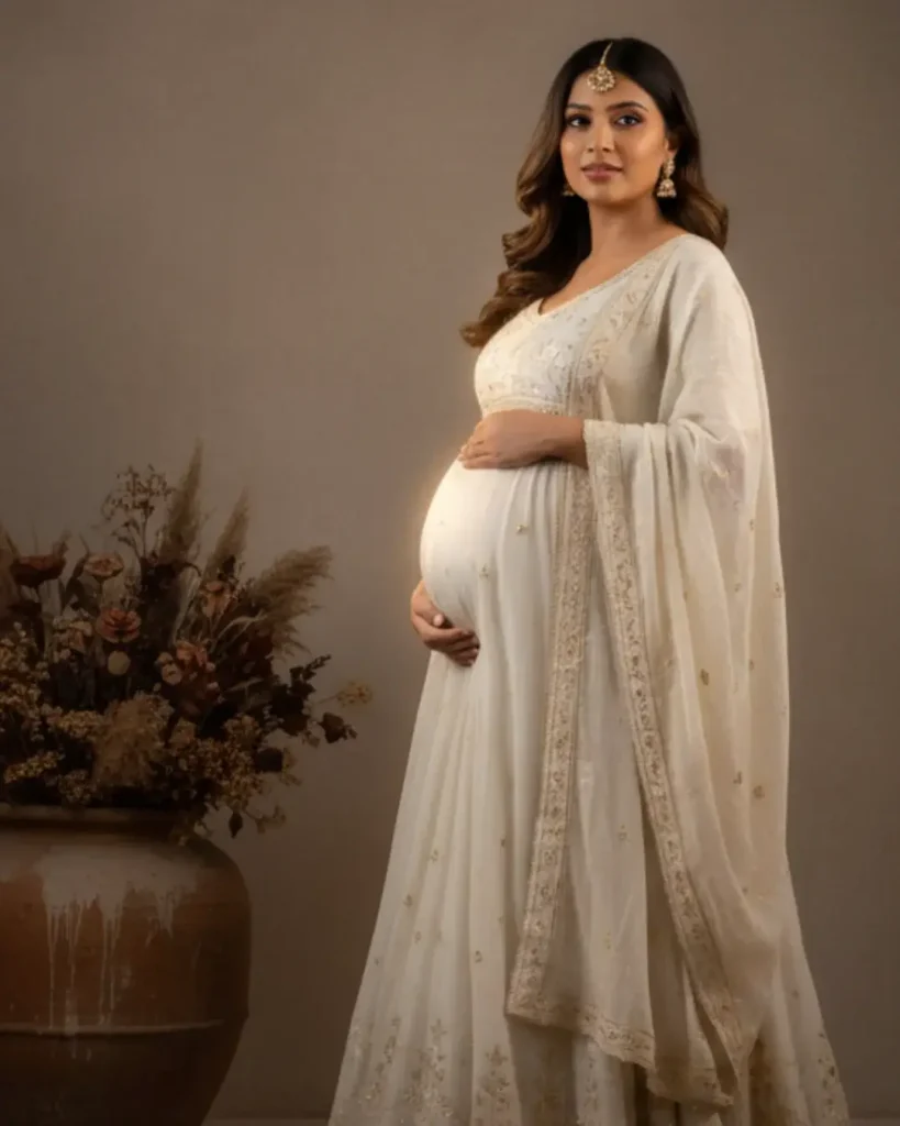
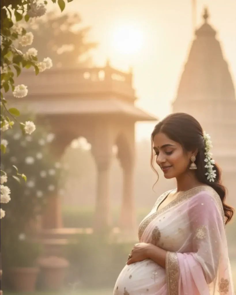
- Whites & Ivories: Represent purity and grace. We use off-white or cream to preserve detail and texture.
- Earthy Tones: Beiges, tans, and terracotta create grounded, organic warmth—perfect for outdoor settings or rustic-themed maternity shoots.
- Modern Elegance with Gray and Taupe: Offer modern elegance and minimalism, ideal for fine-art studio shoots.
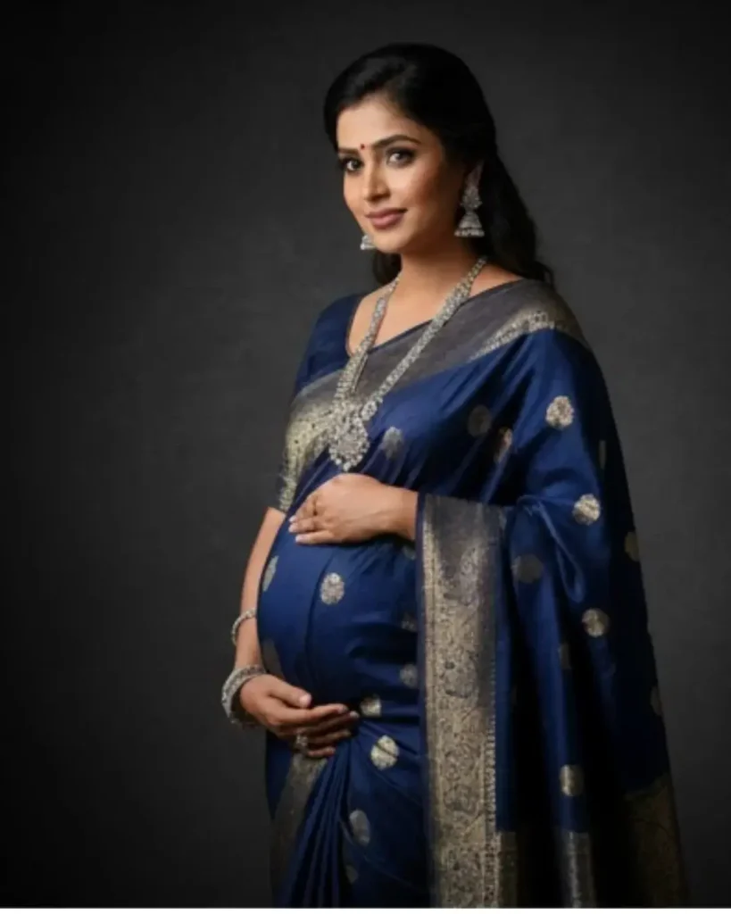
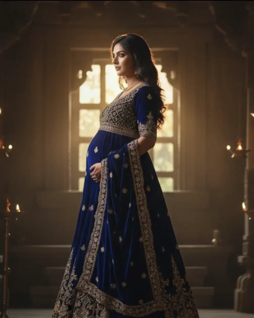
- Black & Navy: Exude confidence and power—dramatic, chic, and technically refined through controlled lighting.
At Maternity Shoots, we balance these tones through expert exposure control and soft directional lighting to bring out natural depth
Contextual Harmony: Season, Setting & Skin Tone
Seasonal Color Selection
- Spring / Summer: Pastels and light greens — soft, glowing, fresh.
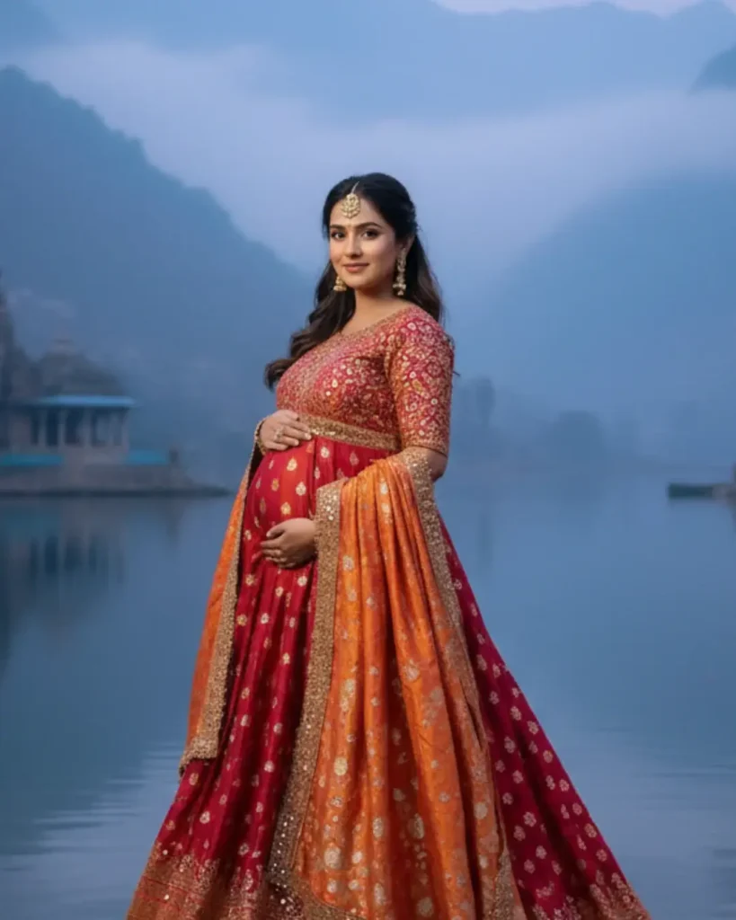
- Autumn / Winter: Jewel tones — bold, rich, and warm.
Our stylists match your gown palette to your shoot season for cohesive results.
Location-Based Choices
- Outdoor: Earthy or contrasting tones complement nature’s colors.
- Studio: Controlled lighting = flexibility; jewel tones or monochromes work best.
- Home / Lifestyle: Coordinate with interior tones for timeless wall display harmony.
Personalized Color Matching
- Warm Skin Tones: Coral, mustard, olive.
- Cool Skin Tones: Lavender, navy, emerald.
- Neutral Tones: Soft pink, champagne, or sage
Color, Fabric, and Light Interplay
- Flowing fabrics create dreamy, ethereal images.
- Structured fabrics emphasize the bump.
- Avoid skin-tone-matching colors to maintain separation and contrast.
Our wardrobe consultation ensures every shade enhances your glow under real lighting.
Mood-Driven Palettes
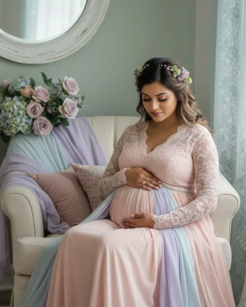
Serene & Feminine (Pastels)
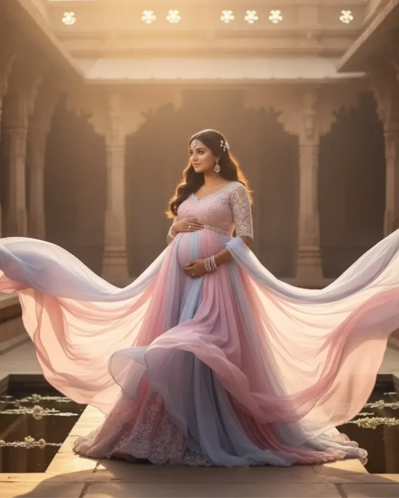
Blush, lavender, sage, and powder blue evoke tenderness and purity—perfect for soft, natural light portraits.
Pro Tip: Pair with minimal makeup and light textures like chiffon or lace.
Bold & Luxurious (Jewel Tones)
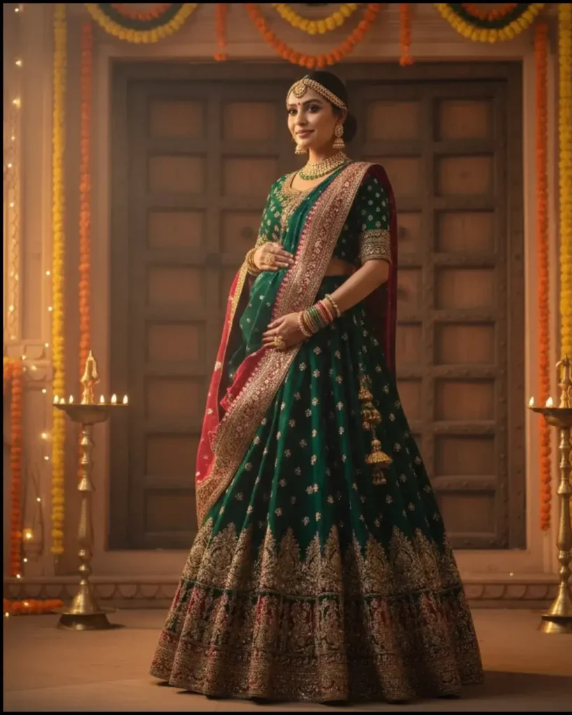

Emerald, ruby, and sapphire bring confidence and elegance—ideal for dramatic studio setups.
Pro Tip: Pair jewel tones with gold jewelry for a regal touch.
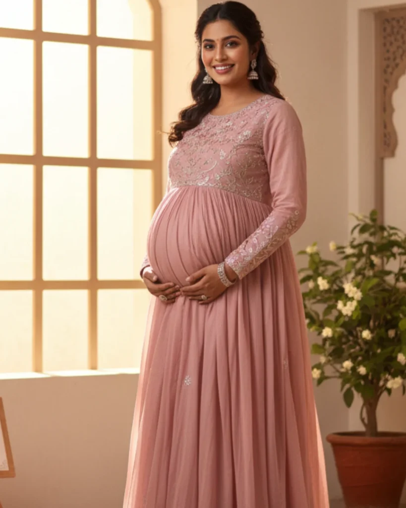
Intimate & Romantic (Metallics & Softs)
Champagne, rose gold, and pale beige glow beautifully in window light for boudoir or indoor sessions.
Pro Tip: Choose satin or silk—these fabrics reflect light perfectly.
Gender-Themed Palettes
Powder blue, blush pink, or balanced neutrals symbolize subtle storytelling—beautiful for gender-reveal or family portraits.
Styling, Fabric & Family Coordination
Fabric & Texture Dynamics
Flowing fabrics (chiffon, tulle) create movement and glow. Structured materials (velvet, satin) add definition.
Avoid overly shiny materials that reflect harshly.
Family Coordination
- Choose complementary shades for family members.
- Avoid busy patterns, logos, or clashing colors.
- Match formality levels to maintain cohesion.
- Utilize client wardrobe resources for the best results.
Use the “Complement, Don’t Copy” rule—blend tones within the same palette.
Example: Blush gown + beige partner outfit + soft white for children. Keep the mother as the focal point with balanced tones.
The Maternity Shoots Client Closet Advantage
Our Client Closet offers handpicked gowns tested for lighting, color, and comfort—so you can arrive stress-free and photo-ready.
Technical & Post-Processing Perfection
Colors to Avoid
- Neon tones (reflect light, distort skin tones).
- Skin-tone matches (flatten depth).
Managing Complex Hues
White can overexpose; black can lose detail. Our photographers use rim lighting for dark gowns and diffused setups for whites preserving detail and form.
Editing for Natural Perfection
We enhance colors naturally:
- Balance white tones.
- Refine skin tones.
- Adjust warmth to match emotion.
At Maternity Shoots, we ensure every final image reflects truth and artistry—authentic, luminous, and timeless.
Building Your Signature Color Story
Step-by-Step Palette Framework
- Define your emotion: Calm, bold, elegant, or intimate.
- Match your setting: Season and environment dictate tone harmony.
- Balance skin & light: Warm tones for warmth, cool tones for contrast.
- Plan display harmony: Match portraits to your home décor.
- Finalize with experts: Our team ensures your colors photograph perfectly.
Visualize with Mood Boards
We help design a custom color mood board—outfits, lighting, and tones tested digitally before your session. This ensures your portraits look exactly as envisioned
Confidence & Authenticity
True beauty comes from comfort. The most flattering color is the one that makes you feel confident. Our role is to bring that emotion to life through color, light, and presence.
Conclusion – Your Colour, Your Story, Your Legacy
Colour is the emotion your photograph speaks in silence. From the softest blush to the deepest emerald, your palette becomes a memory—one that glows forever.
At Maternity Shoots, we craft portraits where light, color, and feeling merge into timeless artistry.
Ready to design your color story? Book your personalized maternity session → Let your colors tell your story—naturally, artfully, and forever.
Note: All images shown in this post are AI-generated and are meant for guidance and visual reference purposes only, showcasing possible colour themes and styling inspirations.
Frequently Asked Questions (FAQ)
The ideal time is between 28 to 34 weeks of pregnancy, when the baby bump is visible, and the mother feels comfortable and confident.
Contrast works best—light outfits for dark backgrounds or vice versa.
Complement your tones (e.g., blush + beige, emerald + navy), not match them exactly.
Jewel and monochrome for studio; earthy and pastel for outdoor light.
Neons and skin-tone matches—these distort skin tones on camera.
Shreya Kumari is an experienced Digital Marketer, photography assistant, and content writer at maternityshoots.com. She specializes in maternity and newborn photography and has over two years of hands-on experience working closely with professional photographers and clients. Through her writing, Shreya shares practical insights and behind-the-scenes knowledge, helping parents understand and prepare for safe, beautiful, and memorable photoshoots.